Category: Uncategorized
Branding works for YOU – A presentation to Prosper Club Business Network

Fix for Rexel Staple Wizard

If you are like me and a bit of a geek and love mechanised office desk kit, then you may well have one of these! The delightfully eccentric ‘Staple Wizard’ automatic mechanical stapler by Rexel. #Repair #Recycle #Reuse #Staple Wizard
 You will find that eventually the bushings in the mechanism disintegrate, and since these devices are no longer available – and if you have any sort of practicality about you – a fix is needed… There is little online, so ‘Designer Hat’ on I have devised a solution.

There is a metal shaft which passes through the destroyed bushes, with a central roller that passes through the operating lever arm and is secured by miniature circlips either end.
Fix #1 – The easy option. The bushes need replacing with two small pieces of rubber tube (8mm o/d x 3mm io/d x 6.5mm).
Fix#2 – More secure and resists sideways movement. A combination of rubber tube (8mm o/d x 3mm i/d x 5.5mm) and nylon washers (12mm o/d x 3mm i/d x 1mm) as in the diagram below.

If you want me to send you the components (8mm Rubber Tube and Washers @ £10 + VAT), get in touch with me on mgt@equinoxpartners.co.uk or WhatsApp me on 07799 1066 33.
STEP 1 : Remove the battery cover, the batteries and unscrew the four small cross-head screws that hold on the base cover.
STEP 2 : With a small flat screwdriver carefully disengage the four cover tabs from the base. It is quite tricky but with a bit of persistence the clear acrylic cover comes loose.


STEP 3 : Locate the small metal shaft, its roller, the two miniature circlips and remove from the assembly.
STEP 4 : With a pair of fine tweezers detach the circlip from one end of the shaft and put in a safe place (seriously small and losable). Slide out the roller too.
STEP 5A : (Fix #1) Slide onto the shaft the first piece of rubber tube, followed by the roller and reassemble back in the mechanism. Pass the shaft and roller through the lever arm and then slide on the second rubber tube from the other side. A bit of wiggling to get it all in place and the carefully re-fix the circlip to the other side. Fiddly and use the tweezers to secure in place.
STEP 5B : (Fix #2) Similar to above. Slide onto the shaft the first piece of rubber tube and reintroduce this to the mechanism. Next fit the nylon washer and pass through the lever arm. From the other side fit the roller over the shaft and through the lever arm, then the second nylon washer and the second piece of rubber tube. Secure all in place with the circlip, as above.

STEP 6 : Reassemble the base, reinstall batteries and battery cover. Check mechanism is working satisfactorily. (Keep fingers clear as the mechanism is quite powerful.) Clip the clear acrylic cover back into place.
Happy Stapling!
Branding – Greater than the sum of the parts
“It’s just a logo” No!
‘Branding’ represents the personality of your business. It is a vital marketing tool to leverage customer decisions. It becomes recognised by your customers. It represents what your business stands for and gives them confidence in their loyalty.
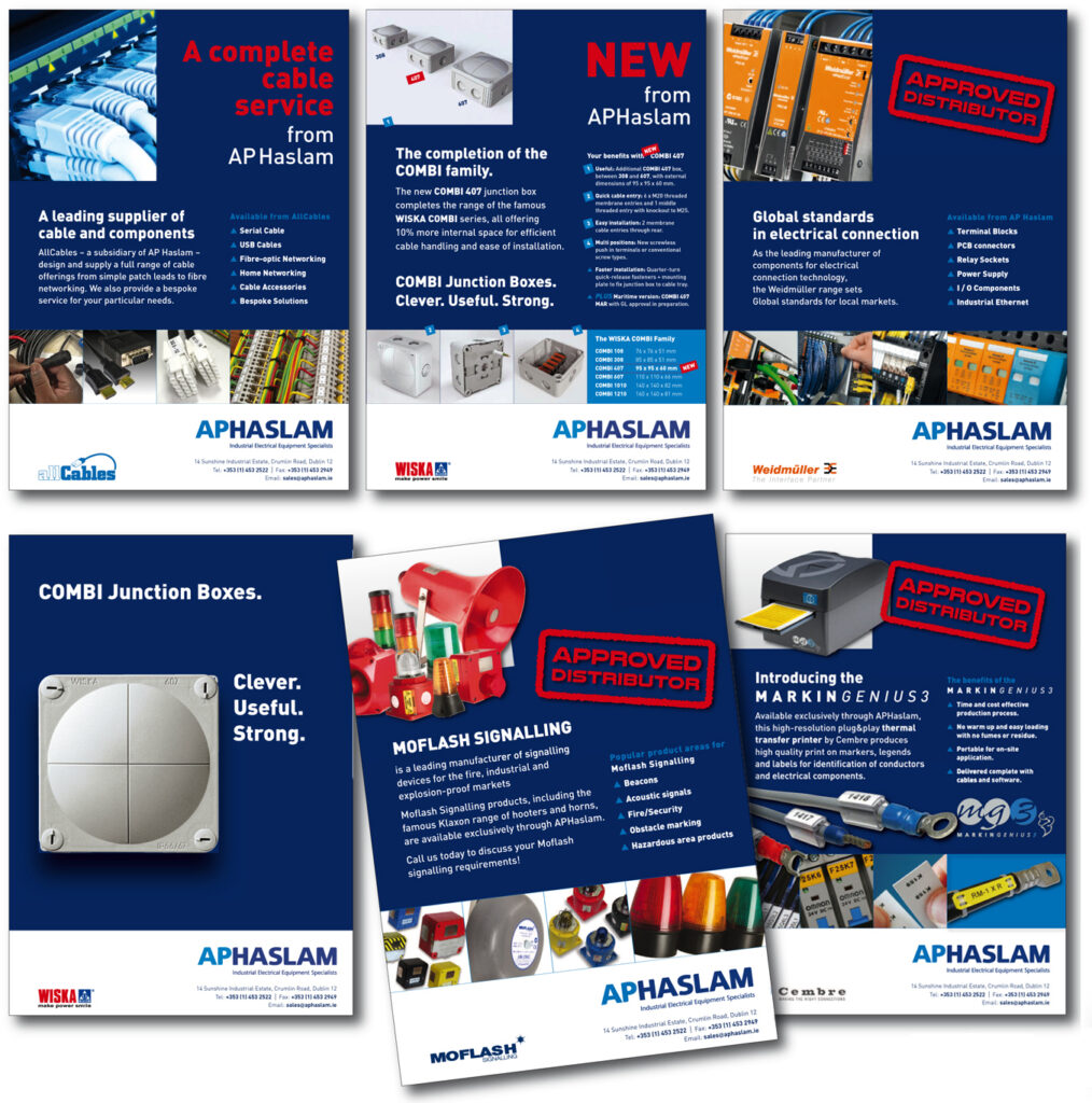
A strong brand stirs customer emotions, both positively and negatively! By establishing an overall format for the way that your brand is displayed in the media over a period of time, your campaigns gain momentum and recognition. https://tinyurl.com/2zp6fj82
A brand framework for advertisements proclaims to your market on a regular basis that you are the ‘go-to’ supplier for their needs, a knowledgable and experienced provider – and in return, your customers gain confidence in your service and products.
However, behave badly under your brand or provide a poor experience and it can also create animosity and rejection – a double-edged sword.

Because a brand appeals to the emotions it instantly, subliminally, affects the behaviour of potential customers by attracting – or repelling them.
Used well, it is an opportunity to engage customers at this instinctive level and to immediately gain their confidence and affect the longer-term relationship that they have with your company where your brand influences their default choice.
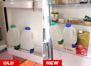 Less perceived risk or value-for-money, if the experience is good – rejection and counter-productive publicity, if a brand behaves badly or provides a poor design or service.
A brand can, over years of honing, create loyalty and an emotional bond with your customer. It encourages tribal instincts and passion. Football clubs and supermarkets really understand this.
And ultimately, customers become your salespeople. Emotional attachment to a particular Brand creates a unique connection with customers that cannot be replicated by competitors.
Your brand guidelines and framework, once established, makes it is so much easier and economic to generate new material that falls within your brand template. A designer, when part of the marketing team, provides that consistency and economy of production.
A brand’s Guidelines provide a framework and a policy within which to easily and economically develop new materials. This ensures consistency of presentation and immediate customer recognition across the ‘marketing mix’, empowering the brand image and lowering marketing expenses because of the established templates.
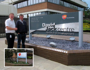 And remember, a great brand is also recognised by your staff as banner under which they perform and behave as a tribe, encouraging teamwork and pride in their work.
See our work with GSK: https://tinyurl.com/yr2hhus8
and Bellavita https://tinyurl.com/ymcp3628
Credibility. Clarity. Consistency.
And ultimately, the Value of the Brand carries weight as valuable market asset at company sale time. Sell the company – you will attract buyers wanting to buy the brand because you are providing ready-made customers and their loyalty.
What’s not to like? Simples!
Remembering Jeremy Bond
Jeremy Bond was a financial marketing genius, whose companies, Moorgate Marketing and latterly, FMCi, served as consultants to a wide variety of banks and insurance companies, both nationally and internationally.
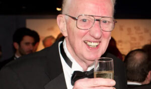 Equinox Partners had the good fortune and privilege to work with Jeremy for more years than I care to recall, but we met in the early ‘90s and we collaborated as a ‘virtual agency’, sharing an office in Old Street and, thanks to the revolution in IT, remotely from our own premises in the later years.
I always said that he wrote the Words and I played the (design) Music.
Our relationship took us from the Baker Street boardroom of Abbey National where we presented the new branding for Cater Allen Private Bank, to the heights of the skyscrapers in The City for Butterfield – from Allied Irish Bank in Dublin to Abbey National Offshore in Jersey, Spain, the Emirates and Hong Kong.
This is my eulogy to Jeremy that I was honoured to present at Park Theatre, 8th May 2022.
Jeremy laughed a lot! He took great pleasure and amusement from what he created.
As Bob Townsend said : “If you are not in it for fun or profit, what are you doing it for?”
The famous Python, John Cleese, had the good fortune to interview the Dalai Lama and asked why Tibetan Buddhists laugh so much. They are constantly in fits of giggles – Cleese said that it is the most delightful thing to be around them.
Very seriously, the Dalai Lama said that laughter is helpful in teaching and political negotiations – because when people laugh, it is easier for them to admit new ideas into their minds. And laughter leads to creativity.
As we laugh, we go from the tight little circles in our minds and into more wide-ranging creative circles – and we take in new possibilities.
Jeremy’s laughter was not frivolous laughter, but the laughter of a creative genius. Laughter is a tremendously healthy thing. It creates and reinforces a feeling of relaxation and, therefore, creativity and confidence. Strong organisations are run with a sense of confidence coming from the very top. And Jeremy’s laughter was infectious.
Hard-working, driven people, such as Jeremy, have the capacity for both ‘Hare and Tortoise thinking’ (as the Buddists describe it) – the Hare having the ability to process large amounts of information and work hard – and the Tortoise, the kind of free-flowing creative thought that allows one to sleep on a problem and wake the next morning with a solution.
He was always a pleasure to work with. But that is not to say that his drive and energy couldn’t be rewardingly exhausting.
He would be constantly phoning me to see how a design job was progressing. I would laughingly complain that “He was always pulling up the daffodils to see how the bulbs were growing” – and exhorting him to “Trust me – I’m a designer!”
Our late-night sessions in the office to meet some deadline or other, would often see us answering the phone “Hello! ‘Midnight Marketing….’ “.
Jeremy had a phenomenal capacity for working creatively and comprehensively – a lovely man, a brilliant wordsmith and marketing communications genius.
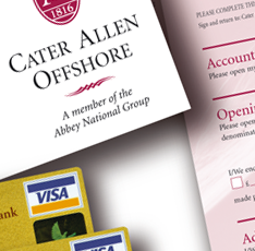 An illustration of this was recalled by Malcolm Corrigan, Senior Marketing Manager of Cater Allen Offshore (Bank) in Jersey.
Malcolm recalled a particular occasion that epitomises Jeremy’s strengths.
“An Abbey Offshore Bond was due to mature. Many customers had large amounts tied up in the maturity and there was pressure to both retain their investments with the Bank – and even grow ‘the Book’.
The promotion necessitated a lot of marketing collateral – direct mail letters, a brochure, advertisements, flyers, Terms & Conditions and a range of Application Forms. Malcolm recalled Jeremy saying, quite calmly, “Is that all, is there anything else that you need?!”
Briefed late on a Thursday, by the afternoon of the following day Jeremy was straight back with literally everything! All that was needed was to amend the date on the top of the direct mail shot – the fine detail omitted by Malcolm himself!!
Jeremy’s genius came to the fore when another client came to him with a problem.
They had a series of 3-year, 5-year and 10-year investment bonds all launched without consideration for the Maturity Dates, which in reality all coincided around the same time.
The consequences of the policyholders all cashing in their bonds – and withdrawing their money at the same time was too awful to contemplate.
Jeremy was tasked to engineer a marketing proposal to ensure that a significant proportion from these maturing bonds were ‘recycled’ – with a minimum target of money to be retained.
Jeremy’s ingenious solution of offering ‘New Bonds for Old’ netted a retention figure far in excess of the target. He was seen as a saviour of the company.
Over the years, our relationships with the Irish market – AIB Bank, and particularly Ark Life its subsidiary – were one of the most rewarding and fruitful.
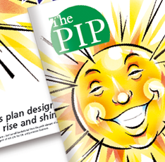 We always had a good laugh when we were coming up with ideas – such as Ark Life’s ‘Wake up your Money’ investment campaign.
Humorously and off-beat, his was characterised by a series of Early Morning ‘Rise & Shine’ cartoon characters – ‘Sunny’, ‘Alarm Clock’, ‘Toaster’ and ‘Radio’ – these were all aimed at invigorating the Irish savings market. National advertising, posters, billboards and bank’s staff handing out the character badges was with notably successful. So much so, the campaign was copied by some of the Bank’s competitors.
 Tony Doyle, AIB’s Director of Wealth, proposed that they create an educational booklet to be given out through the Bank’s network.
Called ‘Pensions Made Simple’, Jeremy immediately suggested one on flying to Mars and say ‘It’s not Rocket Science!’.
Tony recalls that he and Jeremy co-wrote ‘Pensions Made Simple’. Tony described his technical efforts as – ‘a mundane, uninteresting pensions workbook’ – and gave it across to Jeremy who then re-wrote, re-ordered and re-assembled it and – and as Tony said – ‘Made it come alive’.
“What a truly fantastic, gifted, talent he had! When ten thousand copies was considered a best seller, we distributed sixty thousand copies into the Irish Market over two years – and earning an award from the Plain English Campaign.”
Jeremy was somewhat unconventional in his approach to business – he didn’t believe in performance contracts – or even fixed-rates and monthly fees.
Putting it politely, he said: “Someone always ends up dissatisfied. You are either working your socks off for a fixed monthly rate – in which case you are unhappy – or if you are not doing anything, the client is paying for you to sit on your bottom! So they are unhappy!
“If WE are any good, THEY will come back for more!”
Indeed Paul Turtle, MD of Cater Allen Bank, endorsed this approach by suggesting we were: “The first agency he haven’t wanted to sack at the end of the first year!”
Jeremy showed enthusiasm for the Game of Cricket on a daily basis, suggesting we “Knock them off in Singles” when tackling an insurmountable pile of work.
I have never been one for Cricket, not since I was smacked in the eye with a bat at the age of 8 (lots of blood and screaming) – and later sent off the pitch, described as a ‘Yob’ for throwing the ball too hard!
So when Jeremy generously invited me to the Test Match at Lords, I made my excuses, not realising at the time that the invitation had actually originated from Mr Fred Dinmore, Ark Life’s Chairman and the founder of the Cornhill Test Matches.
Jeremy was always a stickler for correct English usage. Even today, I consider his style and attention-to-detail in any writing I do.
Inserting ‘that’ in clauses that “Act as the Object of the Verb…’ ‘He knew he needed to hurry up’… should be ….’He knew that he needed to hurry up’, is one such example.
The Bond family recalls that what was said on the News, Advertisements and Signs often drew comment.
Even a supermarket sign – ‘Exit Both Ends’.
“You CAN’T exit both ends at the same time. There is an Exit at EACH end – you may, of course, use EITHER”
Jeremy’s handwriting was minute and often indecipherable – I did get the hang of it eventually. His editorial adjustments – in ball-point pen – to my artworking would go round and round, adding and expanding.
Frequently I would have to say ‘Too many words’, so we would cut and start again.
I presented him with a very fine pointed pen to help him in his editing work, whereupon the writing became even smaller and even less legible!
A most generous and loyal associate, when we moved from the office we shared in Mitchell Street around the corner to Bath Street – it took only days for Jeremy to phone up and ask if he could come over and work with us on projects.
And there was that one time in Bath Street, shortly after our daughter Phillipa arrived, that Jeremy took a call from Abbey Offshore’s Head of Marketing, Richard Buchanan.
“Is that a baby I can hear in the background?” asked Richard.
We made our excuses…. “Not at all. It must be a crossed-line!”
And Jeremy and Vicky’s generosity was not restricted to our working lives. Clare, myself and our daughter were invited to join the Bond family for the Millennium celebrations in Tobago – a most enjoyable and delightful occasion that we recall to this day. Vicky haggling for Tuna steaks on the beach with local fishermen is one fond memory.
We would also be frequently invited to join them for a night out to indulge Jeremy’s true passion – The Theatre. Jeremy would supply tickets – and I would pay for the meal after.
I would get a phone call “Thursday Night – 7pm!”
The Donmar Warehouse was particularly popular. Always sold out, Jeremy’s Membership allowed us ‘pole position’ in the front row, if not closest to it – the most memorable production being ‘The Blue Room’.
That evening, I had Michael Parkinson to my left – and Nicole Kidman in front of me, with no clothes on about 10 feet away – ‘Pure Theatrical Viagra’ as described by Charles Spencer in The Telegraph – it was indeed quite an evening!
And then every August, Jeremy would indulge his theatrical passion for the Edinburgh Festival.
From the time that the programme was issued in May, he would plan a gruelling 5-day hike around as many of the Theatrical Fringe events that could be crammed into a 16-hour day.
I wouldn’t do it. I was happy for the break. My wife, Clare, however was very enthusiastic – and Vicky was happy that someone was keeping an eye on Jeremy!
So Clare and Jeremy would arrive at Edinburgh’s ‘Ritz Hotel’ (nothing like the London one) at midnight. The first event – a fight with the night porter who wouldn’t believe they were guests!
The following morning, 8 o’clock – and a brisk walk (and Jeremy could walk fast with his long legs) to all corners of the City with Clare trailing behind. From performances in telephone boxes and lifts, to the famous ‘Gilded Balloon’ and ‘The Pleasance’, Jeremy planned for ten performances a day. Often with them as the only audience members.
Jeremy would have done it without stopping, but Clare went on strike. Either they halted for food and drink or go their separate ways.
The compromise of Marks & Spencer sandwiches and an insulated bag became a fixture to get them through the day, with them collapsing back at the hotel after midnight to start again at 8 the following morning. Even the return to the airport would be made to include just one more event.
However, before I close, I would like to mention some colleagues who are unable to be with us today.
Paul Davenport worked with Equinox Partners as a very talented graphic designer. Paul was characteristically christened ‘LAPU’ by Jeremy because of his (lack of) spelling skills – and his failure to use spell checkers to correct this. Paul is currently working as an artist in Birmingham and successfully sells his works on-line to an adoring fanbase of Americans.
Ross Heffler was Jeremy’s colleague at FMCi for a while. Legendary for his dreadful puns and jokes, Ross sadly passed away in 2015. Playing squash at the Roehampton Club he so loved.
And our long-standing friend, Bernard Lynch.
Jeremy interviewed and recommended Bernard as Marketing Manager at Ark Life when the company was in its early days and Fred Dinmore (of Cornhill fame) was Chairman – (Bernard had previously trained as a priest at the Seminary in Rome) – and we had a long, close and happy relationship for over 25 years.
Bernard thought most highly of Jeremy’s skills & expertise in the creation of marketing materials – and especially his attention to detail – and they spoke daily.
He would, however, occasonally ask me to make a small text change and not show Jeremy – “We’ll be here forever on this. I know he will want to rewrite the whole thing!”
After his time at AIB, I was delighted when Bernard invited me to work with him at AP Haslam for another five or six years. Bernard, too, sadly died suddenly in 2022 – only 60 years and a real shock all of us who knew him.
But Clare and I would never have had those opportunities, and others, without our dear friend, Jeremy – and of course, Vicky – and the rest of the Bond family.
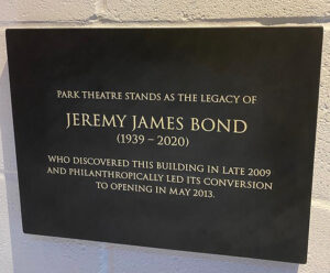 We will always be grateful for your friendship and support over the years. Thank you.
And Jeremy’s legacy of Park Theatre – as Sir Christopher Wren and St Paul’s Cathedral:
“If ye seek his memorial, look around you!”
Thank you.
Peter Bond’s Piece on Jeremy in the Guardian:
https://www.theguardian.com/media/2020/may/21/jeremy-bond-obituary
Musical Fidelity Moves On
Star British Audio name is now Austrian
On 13 May 2018, Austrian manufacturer Pro-Ject Audio Tuning purchased British electronics manufacturer Musical Fidelity from its founder, Antony Michaelson. https://theaudiophileman.com/project-musical-fidelity-buy-news/

Equinox Partners are proud to have been involved with the creation of number of visual concepts for the company’s product range over many years. Some have borne fruit and some, it has to be admitted, have been a bit ‘left field’..
I will too, at some stage do a rogues’ gallery of Michaelson Audio products for those that know https://bit.ly/2yOOqmb!
Meanwhile, here’s the history lesson.
Musical Fidelity was a UK-based, boutique Audio brand started by Antony (sic), a musician, clarinetist and music lover, more than 40 years ago. He remembers the early years as particularly tough and was often told the audio industry didn’t need another amplifier brand. Advice that he says he was glad he ignored.
MF’s first product was a sweet sounding preamplifier launched in 1982. It was called simply, The Preamp. It sold well on Tottenham Court Road, then the HiFi capital of the UK and more was demanded.
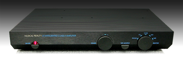
Originally launched in 1984, the extraordinary A1 integrated amplifier was a somewhat controversial product from Musical Fidelity. The electronic design was by the remarkable Tim de Paravincini with the casework designed by Sir Kenneth Grange’s team at Pentagram. Shortly after its introduction, however, Roberts Weaver Design Consultants were approached by Antony to redesign the assembly process, extending the production of the A1 until the early 90s.
With it’s distinctive ‘griddle’ top cover used as a heat sink, the Pure Class A nature of the amplifier caused it to run typically at 55-65°C – controversially too hot to touch for more than a few seconds.
Today, it is considered a design and hi-fi classic – and one that has been recently reintroduced https://www.musicalfidelity.com/products/a1/a1-2
Failing that, look up Wilton Music Mall in Hackney, London http://www.wiltonmusicmall.com/
http://www.wiltonmusicmall.com/products/163
Michael Taylor, while at Roberts Weaver, became acquainted with the redesigning of the A1 to make it more easy to manufacture – and further products were undertaken, notably the larger A100 and then the more powerful A200.
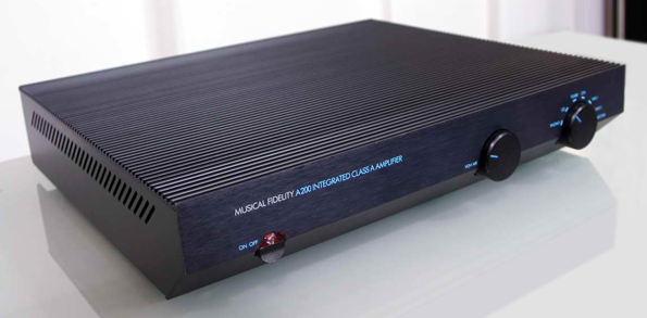
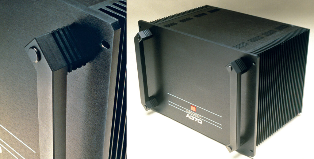
Meanwhile, Antony had also launched a range of spectacular heavy duty Power Amplifiers, the A370 and the A470. Big on both weight and power output they were designed by Michael, along with a junior designer at Roberts Weaver at the time – a young Jonathan Ive – who later went on to become such a world-class success as Apple Computer’s Designer in Chief.
The ‘industrial chic’ visual of a 19″ rack mounted piece of equipment was demanded by dealers and customers alike – and it was many years before the ‘handles’ attached to the front panels of such amplifiers were toned down and disappeared all together.
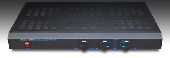
By 1990, the relatively high cost of production of the A1 and its hot-running issues meant that another budget amplifier had to be created. The B1 Integrated Amplifier was developed electronically with Richard Ansell – at that time with Circolec and later to become Musical Fidelity Technical Director – and Michael, who had by this time set up Equinox Partners.
With a budget for the case work of £7, Michael wanted to create a simple linear design. The extravagant machining required for the A1 was out of the question, so it was down to a bespoke aluminium extruded front panel with the smallest profile, non-handed plastic end caps and metal control knobs. Plain sheet metalwork completed the ensemble.
Retailing at £229 (1990) https://bit.ly/2JoDH2q the B1 was highly successful and highly competitive, establishing Musical Fidelity’s credibility as a significant UK manufacturer. Indeed, the B1 is still compared to amps in the €1000-€1500 bracket. https://bit.ly/2JoDH2q
The casework for the B1 sired a host of other products within the Musical Fidelity range at the time, including the valve-driven Tubalog digital to analogue converter (DAC) – the first valve-driven DAC – and the Typhoon range of Pre and Power amps.
Valves have a particular type of sound that is adored by hi-fi aficionados. They are the transistors and other solid state devices for amplification in earlier days. No longer similar to glowing lightbulbs, Nuvistor (https://en.wikipedia.org/wiki/Nuvistor) valve semiconductors are now encased in small aluminium capsules, but replicate the ‘warm’ sound produced in earlier times.
By 1995, Antony Michaelson had the prescience to obtain a sole supply of these delightful components and start providing them in a range of compact products that provided an exceptional sound experience, lauded by critics such as Ken Kessler https://bit.ly/2M3KVuo
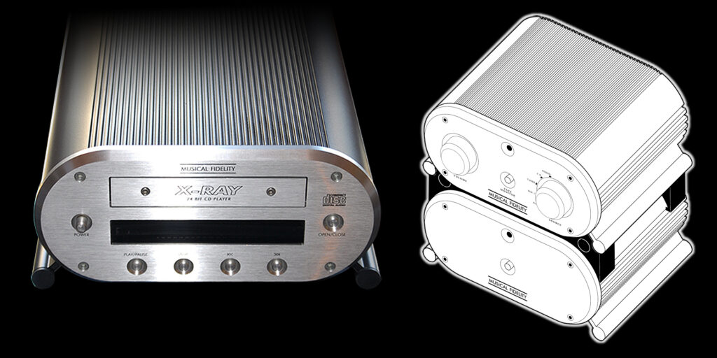
The brief for a new range of products was – ‘piglets’. Simply made, the casework was formed from extruded aluminium, excellent for dissipating heat, and with simple machined front and back panels, the enclosures were simple to make and assemble. The X-series of hi-fi separates was born, consisting of a range of pre- and power amplifiers and later a CD player, the X-Ray, and a Tuner.
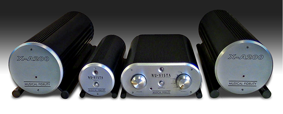
With the aid of spacers, the individual items were stackable and retro hi-fi enthusiasts are still buying up second-hand items at a premium.
As a follow-on from the brutal A370 and A470s in 1993, Taylor at Equinox Partners produced sketches and designs for the radical new F22/F15 pre- and power amplifiers.
Featuring interlocking curved aluminium extruded profiles (note the vestiges of the earlier rack handles) and bespoke heatsinks, the range of hybrid Class A / Valve amplifiers’ clean visuals caused a real shock within the hi-fi audience. “…About as elegant as any hardware I can name…they break new ground…” said one reviewer at the time.
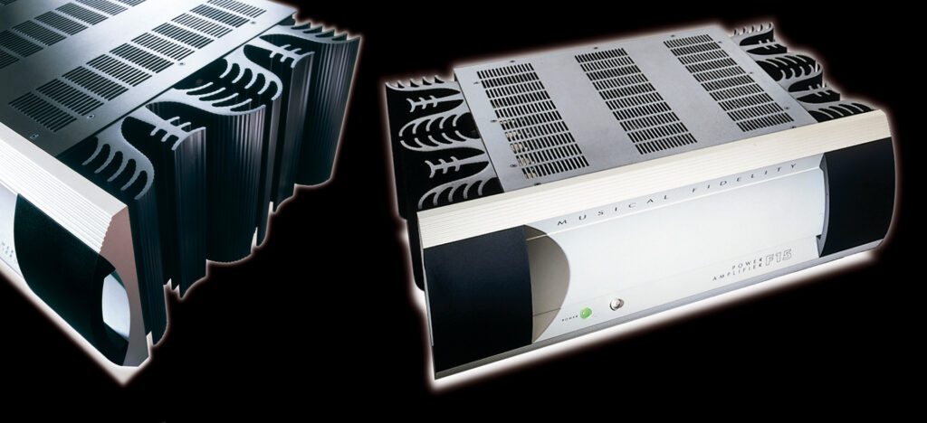
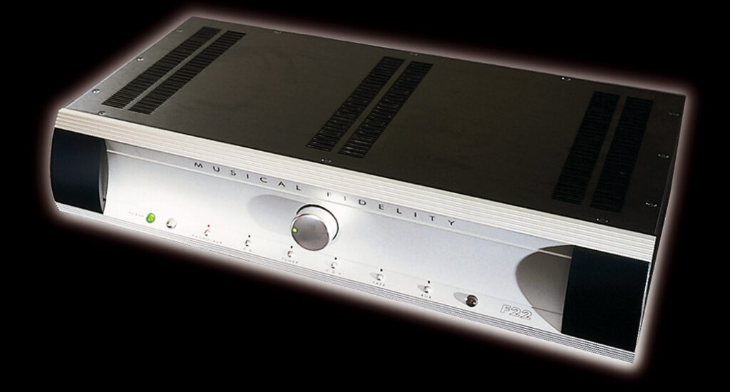
But to the testosterone-fuelled market, the F-Series was deemed too ‘pretty’ and ‘feminine’ in appearance.
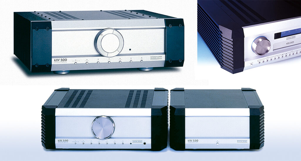
The feed-back from Antony Michaelson was the need for a more brutal, macho range of amps and CD players, so by 2005 the new A5 range heralded a more angular and chunky aesthetic.
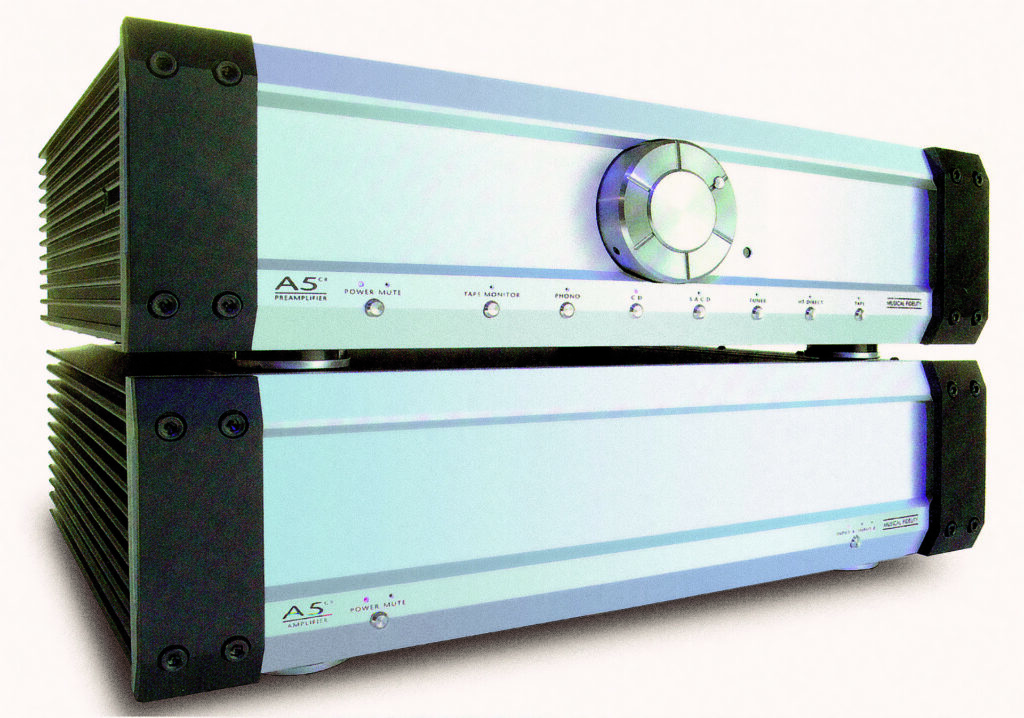
Still featuring heavy aluminium front panels, initially the ‘handles’ that had featured on the products for so long were done away with, to be replaced by ribbed castings and chamfered off corners for the larger kW range of amps and CD players.
Then in 2009, two significant developments occurred with Musical Fidelity’s product line up.
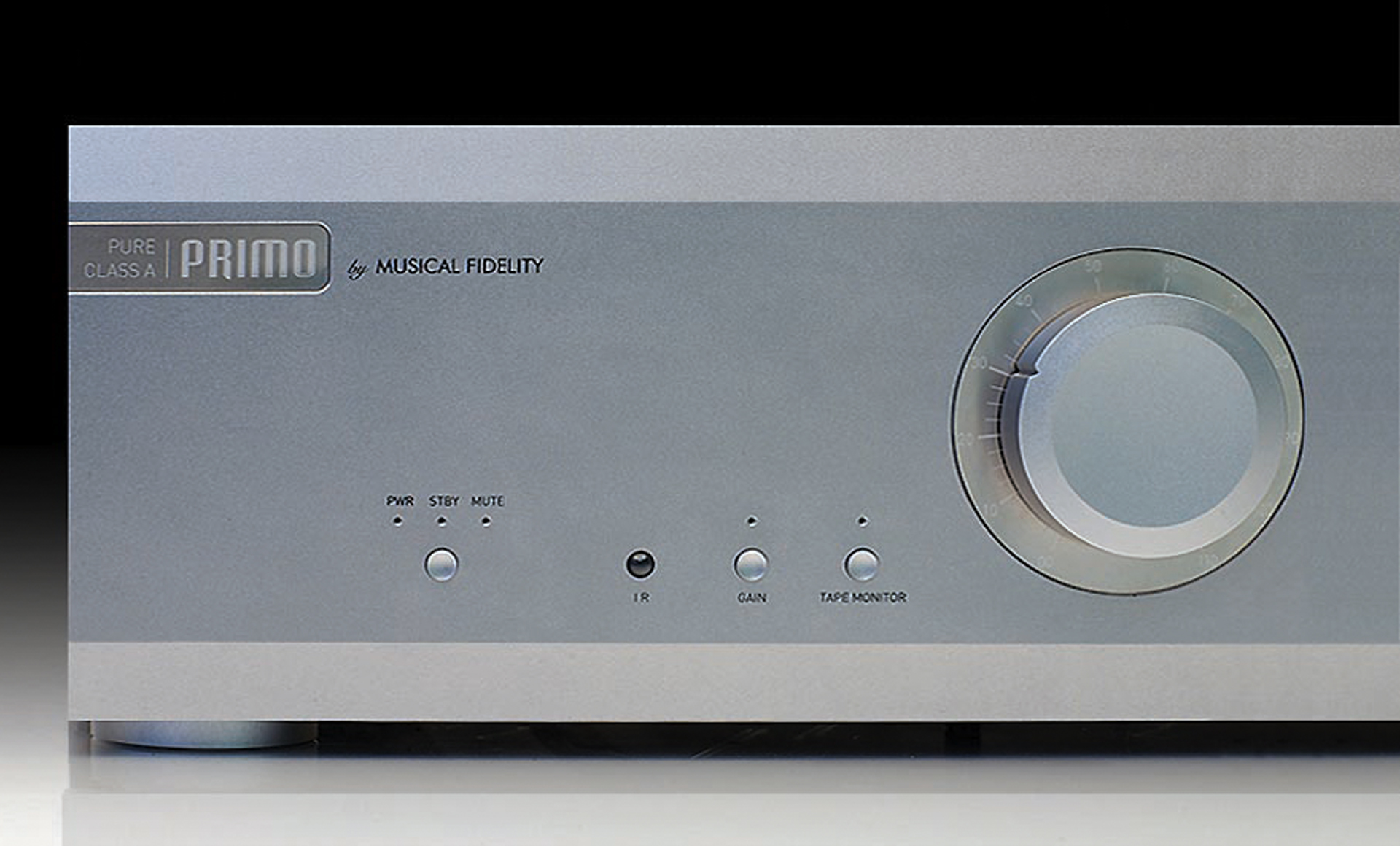
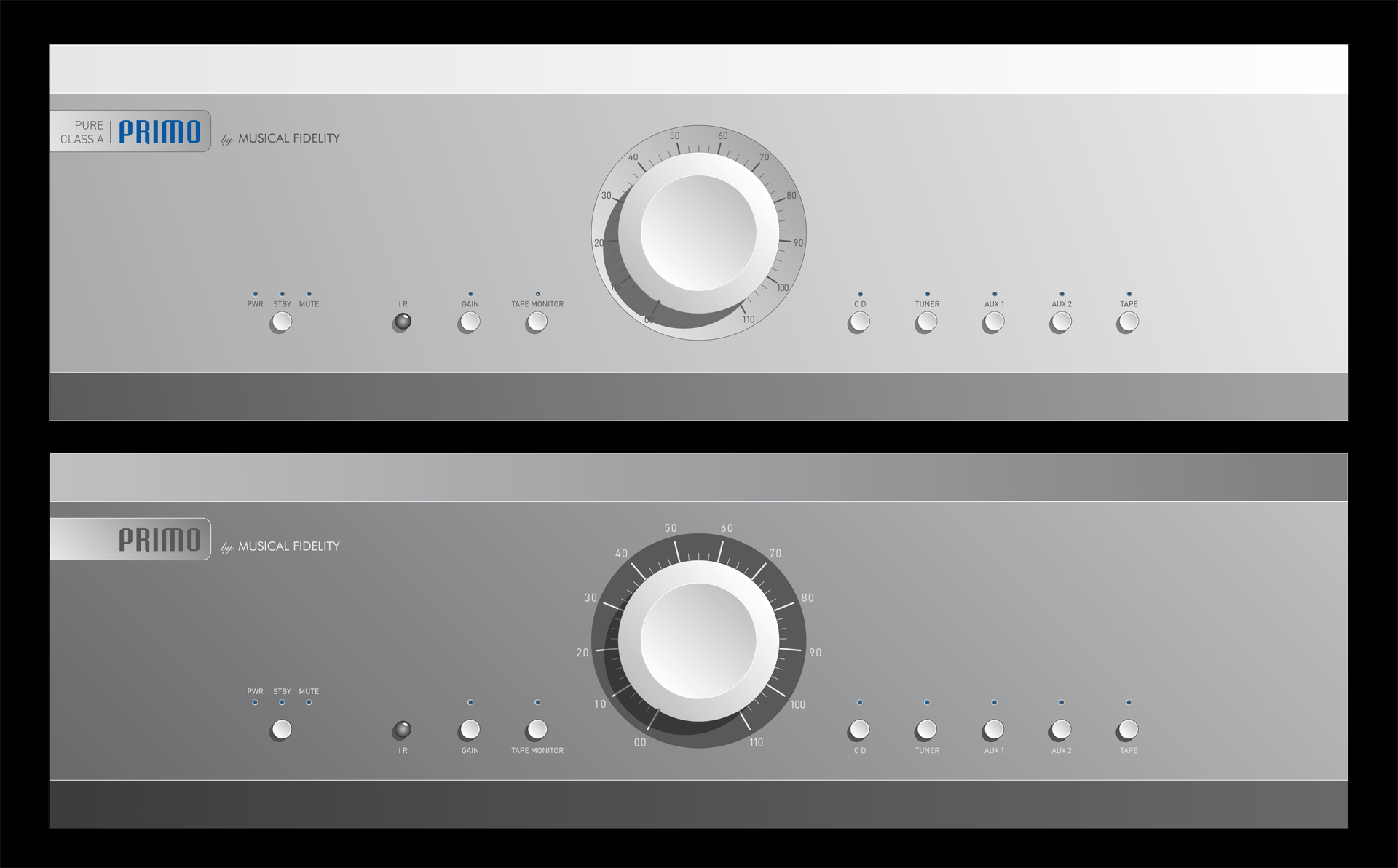
The PRIMO ‘Reference-standard’ pre-amplifier was the herald for a new visual plan. The plain, extruded aluminium front panel with a bleed-in stainless steel etched badge and index for the central volume control created a new, simpler design for the mainstream amplifier range.
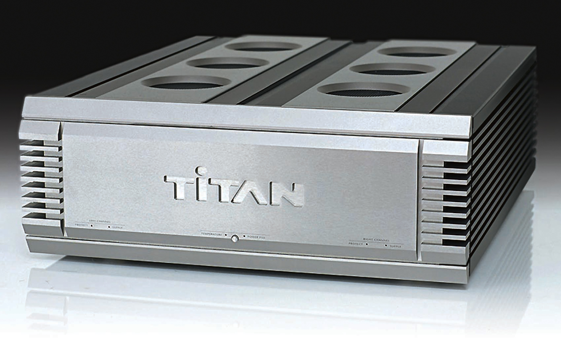
With the PRIMO as the Pre-amplifier, meet the mighty TITAN: 1kW per channel dual monobloc Power Amplifier with an external power supply. Hi-Fi News was “Smitten… ‘The Titan’ is the best power amplifier I’ve used. Never have we heard a traditional amp which does everything quite so well.”
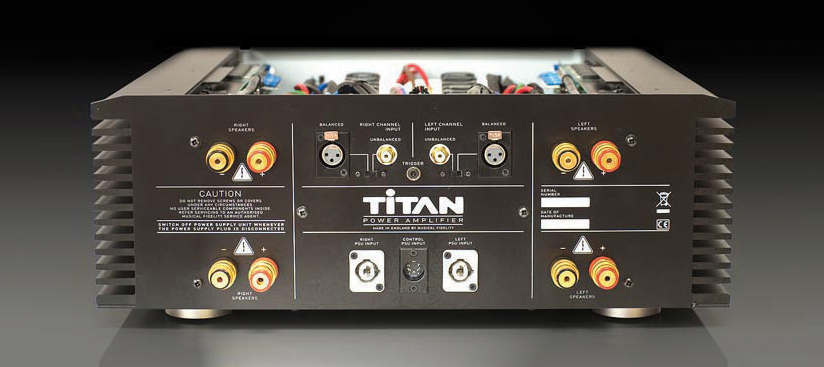

With these exciting visuals from Equinox Partners, Musical Fidelity will endure under the direction of Pro-Ject and Heinz Lichtenegger in Austria – with the support of former MF staffer, Simon Quarry.
However, bear a thought for the talented team who worked in North West London for so long, creating these outstanding products. It has been great working with you over the last 32 years!

For more information go to www.musicalfidelity.com
or view https://youtu.be/oj4U7eRY_Mo?si=BksLPf95p51tknfe to see Simon Quarry and Heinz Leichenegger talk about Musical Fidelity’s development since the acquisition.
I am always happy to talk about Musical Fidelity, product design or indeed and aspect of the design industry.
Contact me through Linked-In and view my Linked-In posts:
•https://www.linkedin.com/pulse/look-me-im-designer-michael-taylor/
•https://www.linkedin.com/pulse/value-remains-long-after-price-forgotten-michael-taylor/
•https://www.linkedin.com/pulse/use-your-eyes-plagiarise-michael-taylor/
Michael Taylor – Equinox Partners
WhatsApp Voice FREE on +44 7799 1066 33
Email : mgt@equinoxpartners.co.uk
150 Middleton Road
London Fields, London E8 4LP
Landline : 020 7254 4555
ExCeL Olympic Anniversary Wall
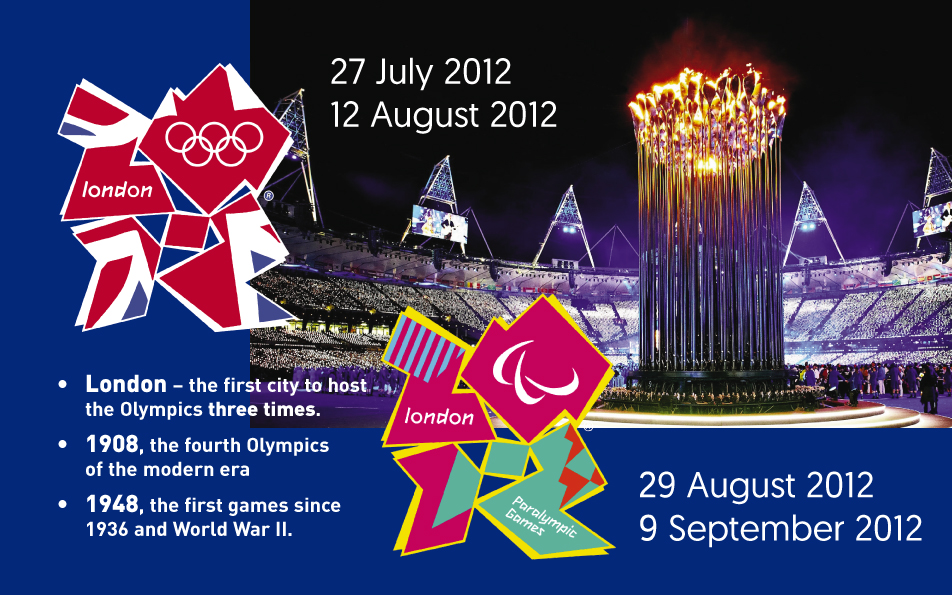
To celebrate one year on from the 2012 Games, ExCeL London commissioned Equinox Partners to utilise the Olympic and Paralympic pictograms that symbolised the disciplines held within their halls, to recognise the key officials involved and the four Gold medal winners who contributed to the success of the Games for Great Britain.

ExCeL London was the most complex venue in the history of the modern Olympic Games. They were host to 7 Olympic and 6 Paralympic sports, a fleet vehicle depot, broadcast compound, training venues and the London headquarters for the Olympics Volunteer Selection Centre.
Over 1.3 million visitors travelled to ExCeL over the period of the Games. The busiest day was Monday 30th July, with 70,000 spectators coming through the venue.
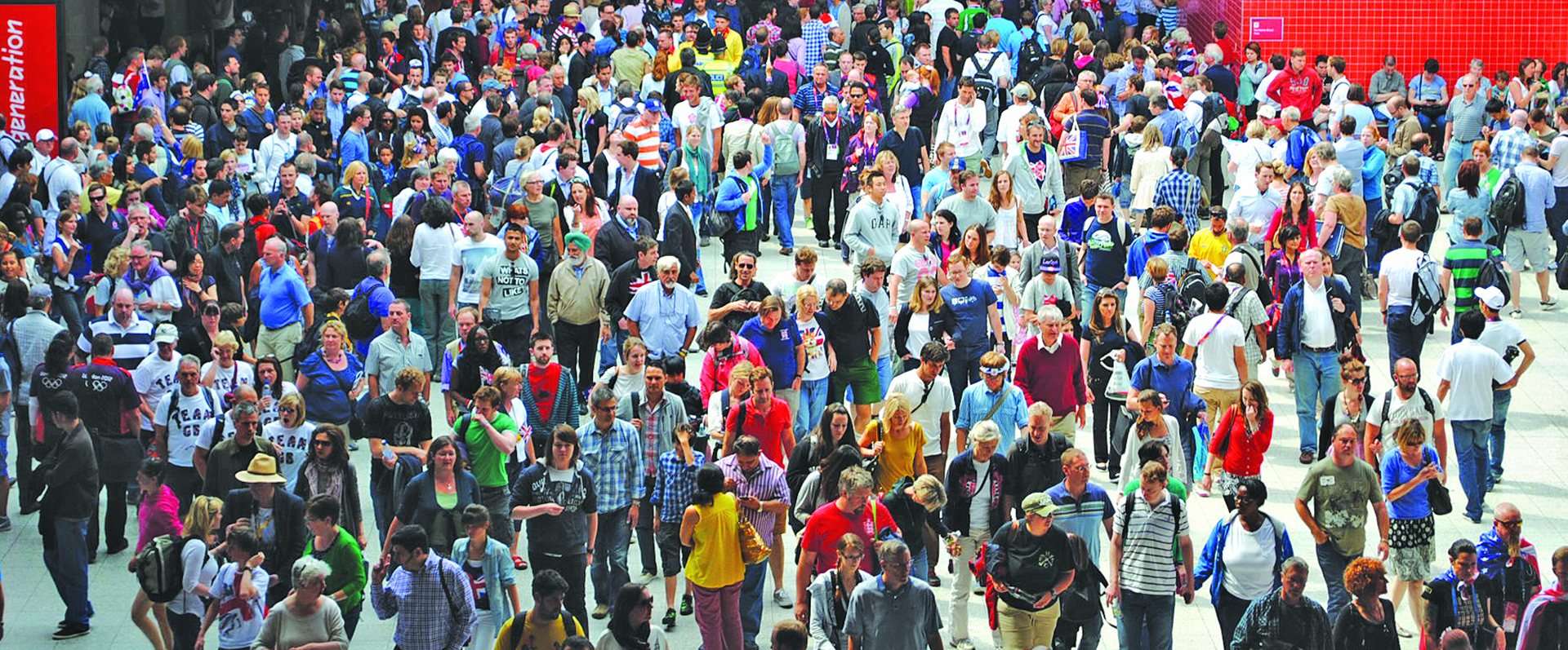
ExCeL was divided into five sports halls with capacities ranging from 6,000 to 10,000. 2,790 athletes competed in these arenas over the Olympic & Paralympic Games with 495 medals being awarded. Team GB won 4 gold medals – 3 in boxing and one in Tae Kwon Do; 2 silvers and 3 bronze. Additionally, the Paralympic Team won 3 silver and 6 bronze medals.
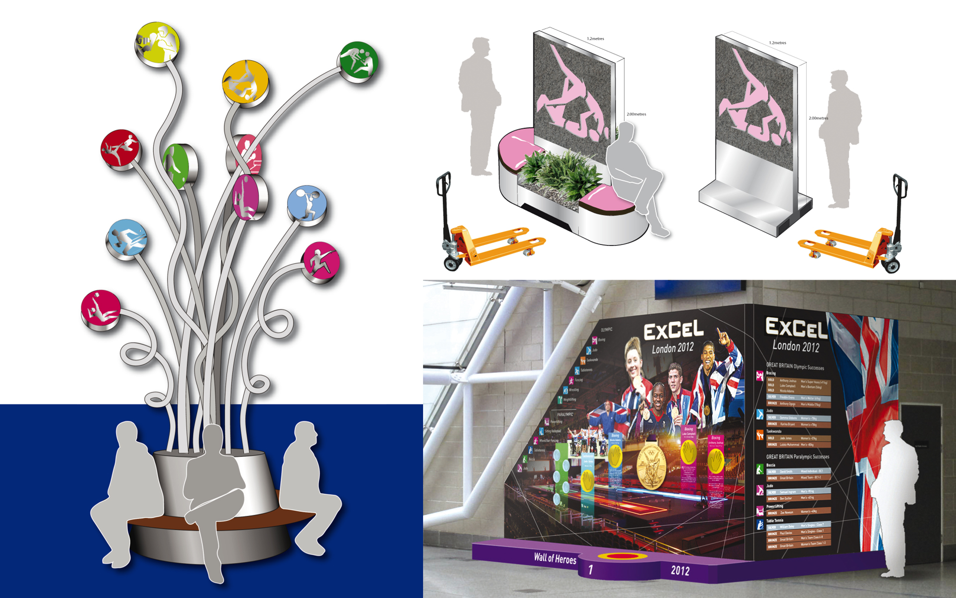
After many suggestions had been proposed by Equinox Partners, it was finally decided that the anniversary display would be installed on the curtain wall at ExCel’s East Entrance atrium.
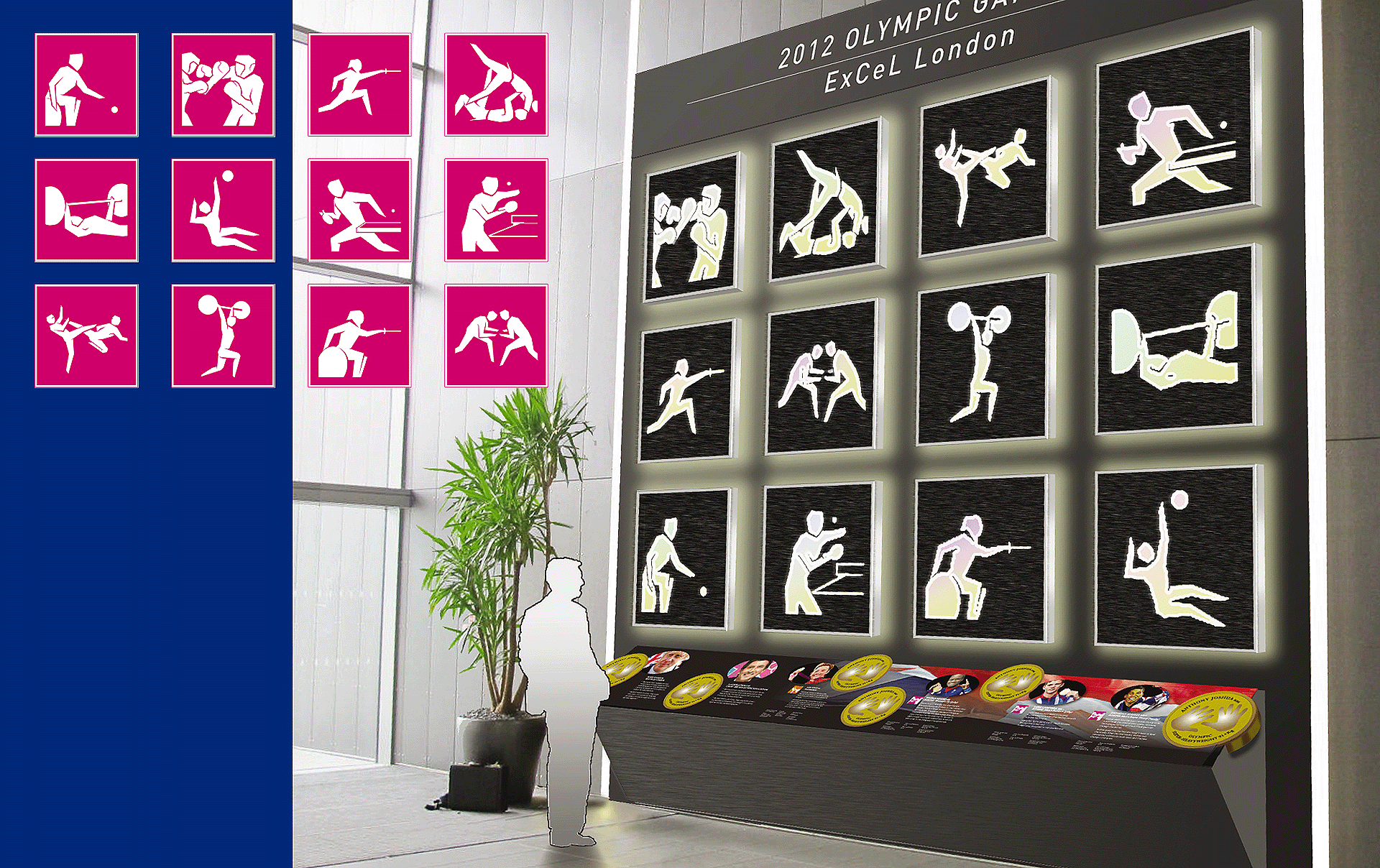
The twelve 1 metre square, waterjet-cut porcelain tiles were combined with internally-illuminated laminated glass and housed within fabricated stainless steel frames.
Weighing in at 50kg for each panel, substantial reinforcement of the existing structure was required, so new steel channel sections were mounted within the curtain wall to which the panels were bolted.
The graphic console at the foot of the 5 metre-high display factually describes ExCeL’s achievements in 2012 and features photos and hand castings of London Mayor, Boris Johnson; Lord Coe, Chairman of the British Olympic Committee and the 4 Gold metal-winning GB athletes, Jade Jones, Nicola Adams, Luke Campbell and Anthony Joshua – all set a height that allows full public interaction, especially with ExCeL’s younger visitors.

Equinox Partners, Michael Taylor and Clare Newton, visited The Surface Design Show 2013 in Islington, where both Imola Project (who supplied the tiles) and Objects In Glass (who were the main contractors) were exhibiting and from then on-going relationships developed.
Imola Projects’ OceanBlack naturally riven-textured tiles were selected for their size, at 1.2 metres square, and which proved to be robust and trouble free when waterjet cut to a very fine degree by Lancashire-based K-Cut.
Harlow-based Objects In Glass were chosen for their enthusiasm and experience in working iron-free glass for architectural installations, where optical clarity is essential for accurate light transmission, and for their complementary engineering ability when it came to the mounting and installation of the final pictograms.
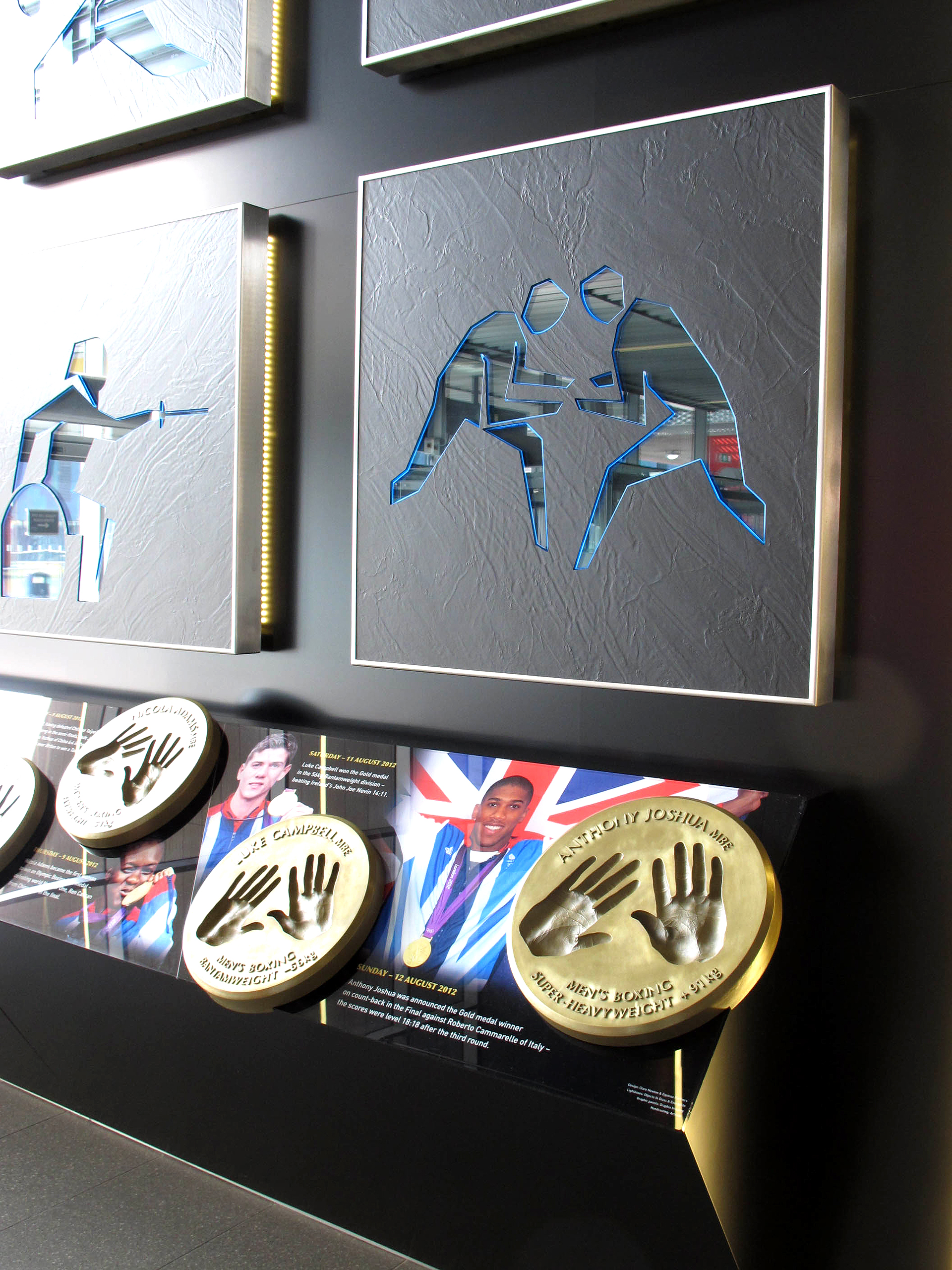
At the 10th Anniversary of the London Olympic Games in 2022, ExCeL London still have a legacy installation that reminds all their staff and clients of the outstanding achievement and contribution they made to the success of the London Olympic Games. We at Equinox Partners are proud to have been given the opportunity. Thank you.
Can a Black Box ever be Green??
Zanshuri Group design and manufacture outstandingly efficient, state-of-the-art Personal Computers – and now are becoming well known for the export of equipment for data centres around the world, the largest being in Lagos, Nigeria.

However, when ‘Made in the UK’ is such a novelty and the performance and efficiency of these products show such promise and competitive lead over the mainstream – they immediately become an even more attractive proposition!
Although assembled from components that are generally available, Zanshuri’s PCs are designed to offer performance that is greater than the sum of the parts – and are completely capable of outshining devices from the established manufacturers.
The ventilation and cooling techniques that are designed into the devices ensure that even the humblest product in Zanshuri’s range operates economically and completely silently – there is no need for sound-generating fans – an immediate dividend from these highly efficient system.
And when independently measured against the most efficient devices from mainstream competitors, Zanshuri’s products consumed, under load, the same equivalent energy as the others at idle.
With customer-specified solid state memory storage of over 3Tb and power consumption (at around 14 watts) being so low, Zanshuri Eco-PCs offer an attractive alternative for environmentally-aware customers looking to source competitive PCs from a UK manufacturer.
|
The figures speak for themselves…. System energy cost per month |
|||||
|
|
Number of computers |
||||
|
Manufacturer |
1 |
10 |
100 |
1000 |
|
|
System X |
£4.72 |
£47.20 |
£472.00 |
£4,720.00 |
|
|
System Y |
£4.33 |
£43.30 |
£433.00 |
£4,330.00 |
|
|
Zanshuri |
£0.39 |
£3.90 |
£39.00 |
£390.00 |
|
What’s in a logo

The branding of a company is the first base for any marketing activity. In a snapshot, it represents the ethos and direction that a company wishes to portray.
It should epitomise the values and appeal of the company, as well as representing its strengths and confidence.
Zanshuri’s values can be summed up: Strong, Confident, Efficient, Technical, ‘Green’, Different.
And Environmentally Aware.
There should be strength and confidence in the typeface, as well as an element of ‘green-ness’.
The black and green colouration is suggested, as:
a) It is different to the ubiquitous blue of IBM (Big, Blue), Dell & HP, and
b) It reinforces Zanshuri’s main sales point – the efficiency and eco-friendliness of the products.
 If you are interested to learn more, contact Chib Nwokonkor founder of Zanshuri, visit zanshuri.com and ‘green up’ your IT Department – and contact Equinox Partners to kick start your company’s marketing campaign.
Simple Sales Leaflet
Equinox Partners were frequently tasked with delivering simple leaflets as leave pieces. By distilling down the messages into the areas shown we managed to satisfy the client’s needs without unnecessary additional wording and crowding space.

Here is how we structure a sales message:
- Strong image and cover layout.
- Branding – keep to guidelines. In this case, we developed a simple text brand.
- Clearly identify the audience.
- Relate to the audience issues (“Use ‘you’ three times more than ‘we’ “).
- Explain what you do to solve the audience problems.
- Itemise the Benefits of your approach.
- Provide a Case Study and Testimonials from existing clients (“Come in the water’s lovely”).
- Demonstrate a clear ‘Call to Action’ and provide contact details.
- Provide a reassuring Brand sign-off and any supporting logos from major suppliers etc.
Bank Holiday working and a rapid turnaround by our digital print partner ensured that the client was able to present these high quality leaflets to conference and seminars within the compressed timescale.
Creative Licensing Services streamlines the purchase and acquisition of rights-managed images by consulting and developing websites that specifically handle and curate them. There is a very real opportunity for both archives and the image owners to simply earn an income by automating the licensing, purchasing and delivery of copyright images through CLS’s service.
Exhibitions – Design as a communication tool
This article appeared 24th April 2018.
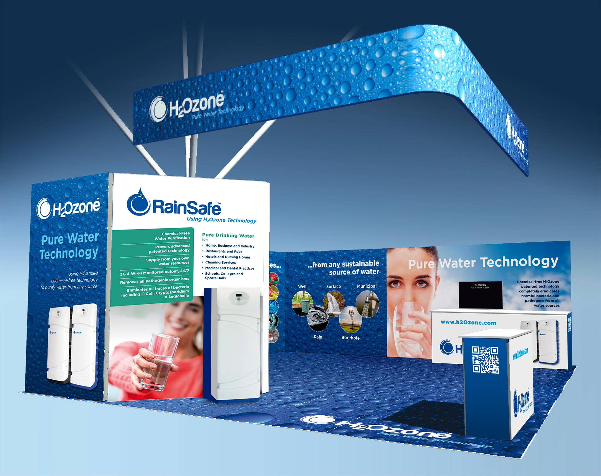 Design is, to the fullest extent, the end-to-end thought processes that go into providing an entertaining, memorable and informative experience to benefit your company and its business.
You have decided to invest in a stand space at a trade show. But don’t go cheap. It is your shop window and will deter visitors if you are not expansive and welcoming.
Your aim is to collect data and contacts for your database for the Sales Teams to follow up, but also to make it an interesting and attractive place to do business and to support your representatives who will be informing passing visitors of your products and services.
Consider your audience
- Those who wish to meet you directly and whom you may have invited
- Those who are directly attending the show and wish to fact-find out of general professional interest
- Those who have attended the show to look for Networking opportunities
Keep it Clear, Branded and Simple.
DO. Involve the designer of your sales materials and website early on. They understand your Brand, Imagery and your Message – and will add flair and imagination that will reflect well on your company.
DO. Keep information display panels plain with large high resolution images.
DO. Keep the logos large and with brand coloured themed panels with simple, clear message that relates to the customers point of view and what they are looking for. Use ‘YOU’ more than ‘WE’.
DO. Sales Staff clothing should be on-brand and consistently coloured, smart for both male and female members.
DO. Train staff to move off the stand and interact positively with passing visitors, thinking on customers needs. The aisles are essentially free space that you are allowed to use.
DO. Make sure that senior members of company staff attend the stand. Happy staff are appreciated for what they are doing.
DO. Keep video presentations concise and on a loop of no more than 1 or 2 minutes. Staff must use the opportunity to interact with visitors stopping to view.
My “Do’s” for enquiry handling
DO. Ensure ALL visitors are scanned by staff if you have taken advantage of the data capture technology. You have paid access their profiles and contact details later. Business cards cost money, so people are reluctant to hand them out.
DO. Make written notes of visitors’ specific requests. Personal attention to detail shows you care.
DO. Use tablet technology to show short videos or website details and interact personally with visitors.
DO. Provide tactile hands-on samples to create intimate relationships with visitors (or use illustrations for high value items). Hand out cards and brochures once connection is made and offer to interact later by dropping samples off on a sales call.
“Do’s” for being sociable
DO. Provide a couple of high stools for staff and visitors to rest weary legs. Or, if space, a seating area to allow intimate discussions.
DO. Hand out water, not alcohol, in branded (or swing tagged) bottles during the day.
DO. Hand out ‘wine-o’clock’ invitations throughout the day to timed evening events on your stand. This will encourage visitors to return to network and learn more about your company in a favourable light.
DO. Lights – essential to attractively illuminate the stand, staff and displays. Don’t rely on the overall ambient lighting provided by the exhibition organisers.
DO. Provide a secure store cupboard for coats, technology, drinks and supplies and to keep the stand tidy.
DO. Build an atmosphere to stimulate visitors. Low or shelf edge lighting, even scenters or a vase of flowers can contribute to the final positive touch.
And now, my design “Don’ts”
DON’T. Create a physical barrier at the front of your stand, by placing a counter or with a line of staff. Keep brochure displays and bowls to collect business cards at the side and move staff into the FREE aisle space.
DON’T. Overcrowd the stand with goods or materials. It’s the staff who should be doing the work.
DON’T. Block access to the stand. Avoid physical or people barriers.
DON’T. Add clutter with piles of brochures. They prevent staff speaking with visitors and a lost opportunity to make further contact with your leads – delivering or posting information, followed by phone call.
DON’T. Let the staff drink the beverages. These are for the opening day and to shmooze the visitors at your ‘wine o’clock’ network.
And FINALLY – DON’T Let your sales staff sit there looking at their mobile phones. There is nothing more unattractive than seeing YOUR sales personnel ignoring visitors and playing games because they are bored.
